Wednesday 30 September 2009

Pannel down the side

The next step we had to do was to do the pannel down the side for the front cover. We chose to do this as it has been done on newspapers we have looked at and thought it was a good idea.
To make up stories for this part we decided to take some of the most common stories found in local newspapers that would relate to readers and make them into our own.

We split this side pannel into 4 sections so we would have to find 4 different stories to fill it up.


The first story we choose was to do one about a strick and choose trains as we thought it would relate to readers. We came up with " Train workersLook at a further strike for third time this year" We also found that a common convention with this was putting the page numbers next to it. The pages that these stories were found on were never directly at the begining or the end but somewhere in the middle, so this is what we decided to do, and choose it to be on page 4.


The second story that we decided to do was something about swine flu as it is quite a major topic for some people but we still wanted to relate it to being local as it was going to be in a local newspaper. We came up with "Local pharmacy providing false drugs for swine flu" and decided to put this on page 5.


The third story we came up with was a crime story as from the research that we did, this is what people liked to read about. The story that we went with was "Drunken yobs smash house windows along streets". We put this story on page 7


The final story we used was just about something that had happened in the local town of Portishead. We came up with " Young girl hit by tractor when playing in local field" and we put this one of page 9.


With all of this done our side pannel looked like this;


Tuesday 29 September 2009

Choosing the headline

When deciding what headline to use for the front page of our newspaper we wanted it to be catchy and effective. We decided on using two different types of headlines to find out which one would be better.

The first type was a single word headline which we had seen in previous newspapers. The word we were going to use would be 'HEARTLESS'. We thought this would be quite effective as it explains sort of what the story is about and how the person in the story was feeling.

The second type of headline we used was a headline that started with the same letter for each word. We came up with 'STOPPED, STOLEN AND STRANDED'. We decided to go with this headline as we thought it was more catchy and explained better about what the story was about.

Monday 28 September 2009

Headlines and font for front page 1

To get us started on some headlines that we could come up with for our story, we researched some to find out how long they were and what sort of language that they used.
From these headlines you can see that they used basic language and they were only made up of few words so they wer'nt that long. Some of these headlines sum up what the story is about. I think the whole point of the headline is to drag you in to the story straight away and make you want to read it.

With the font of the headline you can see that it is very bold and in capitals. This is so it stands out of the page and attracts peoples attention. Some of the headlines inside the newspaper are not always in capitals as you can see on the paper above. This shows that the main headline on the front page is the most important above the rest.


When then went on http://www.dafont.com/ and searched for some fonts that would be good for our headline font.
This is the first one we came across:
We chose this one because we thought it looked slightly similar with the boldness of the font and the letters were also quite clear.


This was the second font that we looked at. We liked this one as the letters were a lot more bolder than the font above and looked alot more like a headline font.


This was the last font we chose to use. This font wasnt from www.dafont.com but was simply made on microsoft word art. We decided to use this font as we thought it looked the most like a headline font. It was simple, clear to read and bold which was what we wanted.

Sunday 27 September 2009

3rd photos for front page 1

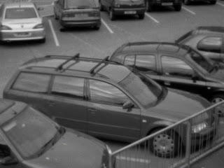
For the third photo on the front page we wanted to get a photo of Bobs car and make it so it looked like it was taken on a cctv camera. We stared off by taking photos of differend cars in different places.

This was the first picture we took. We didnt choose this one because of many reasons. One of the reasons we didnt use this one was because the picture was taken out of a dirty window which makes it look grimey and it isnt that clear. Also the angle of the car wasnt quite right and wasnt really what we wanted, so we moved onto a different place.


We then focused on another car in a different place. This was the photo that we used as we thought it was a lot better than the other one. This is because it is the right angle that we wanted and the right height. Also even thought there are more cars around you can still tell what car the camera is focused on. Even though in the picture above it is clear that that was the car that got broken into it looks a bit set up where as in this picture it looks more normal even though there is still one car the camera is aimed at.

The next step was to make this image look like it was taken by a cctv camera. When doing this
we found it quite difficult to get this effect but got as close to it as we could.


First of all we made the image black and white. We then changed the saturation of the image to make it look more 'crispy' and a little bit blurred as cctv images arnt that clear.


With all these images put together, the pictures on the front of our newspaper would look like this;


A common convention used with pictures on the front page is that they always had a caption at the bottem just underneat the picture or just to the side. With our newspaper layout our caption would fit in better just underneat the picture.
The captions normally described the photo and its relevence towards the story. So with our pictures, we would have to relate the story of Mr Watkins to the pictures.
When taking this into consideration we came up with the caption;
" Devastated teacher Mr Watkins at entrance of Gordano school where his own possessions got taken. "

Story for front page 1

We started to write the story for the first front page focused on Bob Watkins. From our design layout we knew we wouldnt have write that much but we knew it would still have to be detailed and contain important information.

We started off by summing up what our story was about by saying;
' Callas theives robbed a loyal teacher of a lifetime of memories when they snatched mementoes and goodbye gifts from his car on his final day at Gordano School'
This bit would be put in bold as we found this was a common convention of newspaper stories containing this information

We then moved on to giving information about Bob Watkins for example his age and about how he felt when this happened to him;
' Recently retired geography teacher Bob Watkins, 59, was left devistated when he returned to his car to find presents given to him by collegues and friends missing.'

The next part of the story we writ was about Bob Watkins history with the school, as we found this was done a lot in stories like this;
'Mr Watkins began teaching at Gordano School in 1974. 35 years of service to the secondary
school has earned him a legendary position and a lot of respect from students and collegues.'

We then finished this story up with a quote from the head master of the school Graham Silverthorne and what his oppinion was on the situation;
'Head master of the school, Graham Silverthorne stated that "nothing like this has ever happened to anyone in this school especially not to one of the members of staff who have provided us with so much. It's just outrageous and disrespectful."'

We then put at the end of the story that it would be continued onto page 3 so the readers would know where to find the rest of the story.

Thursday 24 September 2009

2nd Photo's

The second photo shoot we did was for the big main photo on the front page. For this one we thought it would be a good idea to have Bob stand by the Gordano sign. Seeing pictures like this on other newspapers front pages influenced this decision as we thought it gave a good indication that Bob was an important person to the school.

These are the two different styles of photo's we took;


This is the first picure we took. We decided not to use this one as we thought that Bob was stood too far away from the sign and the way that the sign was angled it wasnt that clear to see what it said. This photo is also quite dark as the shadows from the trees really got in the way but there wasnt anything we could really do about this. We decided to angle this shot better and see if that would be any better.


This is the second picture we took. We thought this one was a lot better as it was clear to see that it was a Gordano sign. Also in this picture Bob is a lot closer so you can get the emotion on his face which helps focus on what he is feeling and can give more impact on the story. As this was the first picture people would proberally see ( as it is the biggest), we wanted it to be clear about who the victim was and what the story was about from this one picture. We asked a few people what their first impressions was of this picture and they said;


"you can see that the man has been a victim and that the story is based around Gordan school."


"you can clearly see that the story is something to do with Gordano School and that the man looks upset so you know something terrible has happened to him"


Although there are still dark shadows from the trees on the picture we thought we would have ago at editing them on photoshop to see if that would make any difference and this is what it came out as;


This is the final picture that we used. We adjusted the brightness and contrast of the picture to try and make it so it wasnt as dark and we thought it worked quite well. Although you can still see a little bit of the tress shadow, it doesnt draw your attention imediatly. Also the picture is brighter altogether which makes it a lot clearer.


Wednesday 23 September 2009


This was the third picture we took, we decided to use this one was it wasnt too close or too far away but just right so you could gather how he was feeling.

Pictures for story on front page 1

The first pictures we got were the victim shots of Bob Watkins, We took quite a few photos and then narrowed it down to pick from 3 of them


This was the first picture that we took, we decided not to use this one as it was a bit close and the emotion on Bob Watkins face wasnt quite what we wanted.


This was the second picture, but decided not to use this one either as it was a lot closer than what we expected and yet again the emotion wasnt just right.

Story on front page 1..

We wanted the story on this front page to be a crime story as this is what we found people liked when we did our questionnaire. We first of all decided on having it about one of the teachers in our school and that they had committed a crime. We then changed it to them being a victim of crime.

We focsed on one teacher inparticular, Bob Watkins as he gave us many ideas. Bob Watkins had not long retired from working at Gordano School but is continuing to teach his GCSE and A Level classes. The school held a memorial service for Bob Watkins on his last day on the 24th July.

This helped us develope a story about him. We decided to do someone stealing all of his gifts and memorial presents from students and collegues from his car. We thought this would be a good story as it would be quite a heart hitting story.

We didnt want just one main picture for this as we thought it would be better if we got 2/3 as it was quite a big story.
For the first/main picture we thought it would be a good idea to get Bob Watkins to stand by the main Gordano School sign
The second picture we decided to get would be a close up of Bob Watkins and his reaction to what had happened to him.
And then for an extra picture we decided to try and put together a cctv image of Bob's car.

Tuesday 22 September 2009

Newspaper logo and slogan.

The next thing we had to look at was to decide what are newspaper logo would be. Although all the newspaper titles we looked at didnt have logo's we thought it would be a good idea as it would make our newspaper easily recognised. We decided to have the Portishead lighthouse as our logo as it would be easily recognised by readers in the Portishead area. Also it went well with our newspaper title as our newspaper title was about 'guiding' and 'conveying' news to people, thats what the lighthouse did to boats out on the Bristol Channel.

Instead of just having a picture of the portishead lighthouse, we thought it would be a good idea to have an outline of it instead as none of the logo's we looked at were pictures.

We went and took a picture of the lighthouse and then made it into a line drawing, this is what it looks like;


We wernt sure if it would be still easily recognised when it was made into the line drawing, but as you can see that it still looks like a lighthouse. We made the lines quite thick so it looked bold and stood out.


We then had to decide on a slogan for our newspaper as it was a main element found on other newpspers.
We came up with "Shining a light on you"


We wanted this in a slightly different font that what the newspaper title was so we went on http://www.dafont.com/ and choose a font that looked funky but still had a sophisticated look to it;


We thought this was a good idea as it portrayed that we were giving news to the local people in Portishead and went well with our logo and titile. It went with the logo as a light house 'shines light' and the title of our newspaper means giving guidence.

Monday 21 September 2009

Newspaper title & font

The next Step to designing our front cover was to find a name that would fit well and a font that would look good. We knew that in the name it would be something to do with Portishead as thats where we were going to base our newspaper. The second part of the title would be a word to describe giving news and information to someone (like in 'The Mercury' newspaper and the messenger God Mercury). 

We came up with the "Portishead Beacon".
Another influence on our title was a feature that everyone who lives in Portishead knows about. This is the lighthouse. This help us come up the word "beacon" as it shines a light over the Bristol Channel.
"The word beacon means a signaling or guiding device, such as a lighthouse, located on a coast. Or a source of guidance or inspiration"


Now we had the name sorted we needed to find the right font to go with it. We went on the website http://www.dafont.com/ and searched for some fonts that would look good as our newspaper title.


The fonts we found and felt that looked good was;

We chose this one as one of our options as it was simple looking and easy to read. The bad points thou was that it was quite a boring font and didnt really have much going on.


This was the second font we choose. We choose this one as it wasnt as plain and simple as the one above and wasnt as bold which made it look abit more sophisticated.
This was the third font we looked at. We liked this one because the shape of the letters were different and it looked unusual. The only thing we were unsure on was that it some letters were capital letters and the others wer'nt.

This was the last font we looked at and the one that we choose. We choose This one to be our final font as we liked the line that went accross the top of it as it made it look unique and different than just a plain font. The letters were all the same type and the actuall font looked a bit more upperclass than the other ones which is what we were looking for.


We didnt want the colour of the title to just be plain black so we decided to have the colour of it a navy blue as this seemed to occur in all the previous newspaper titles we had looked at. We thought navy blue was a good colour to go with as it wasnt a bright colour but still looked sophisticated.


With all this put together we came up with this, our finished title;


Sunday 20 September 2009

Designing a layout


  1. From the analysis we made on the front pages of newspapers and Phil's ananlysis that he did during the summer we were able to design the front cover of one of our newspapers. We made a base of where we thought things should go and came up with this;
  • The title and logo at the top of the page

The slogan Price date and website just underneath our title

A big picture that takes up quite a bit of the room on the page

The main headline and a story that would be continued on page 2 underneath the picture

A pannel down the side telling the reader what they will be able to find inside the newspaper

An exclusive section/Advert in the bottem right hand corner.

Another newspaper analysis


We found this newspaper which was very similar to the idea we had in mind for our first front cover. We were going to have our pictures in the space where the big photo was. Our headline was also going to be in the same place with a section of the story next to it.
Also the pannel down the side advertising what can be found inside the newspaper was going to be in the same place where ours is going to be placed, and the advert was in the same place but this one on this newspaper was slightly larger than ours was going to be.

Friday 18 September 2009

Photo's on front page

For the photos on the front page, we did a bit of research on what they looked like and how they were set out.
From this there is a range of different photos on here. You can see that some group ones are posed and some arnt. A majority of these photos are set up in a way to make you think about who is the dominant person and who the story is about.
This photo was found on the front page of the evening post. You can see that it is a large photo and is a group photo in which has been set up.


Newspaper titles analysed

We looked at local newspaper headlines and logos to see what sory of style they used and whether the logo was any representation to the area of the local newspaper.


The first logo we looked at was The Evening Post. This logo has used a navy blue font so its not that plain and has used a posh style of writing to make it look a bit different than just a standard font. With this title they have placed the logo in the middle of the two words. The logo they have used is an outline of 'The Mathew', which is a famous ship in br
istol and is easily recognised.
The second title we analysed was the North Somerset Times. This one was also done in a blue colour but a bit lighter than the Bristol Evening Post. The Font used for this headline is not as formal as the one above but still has an element to it that made it look classy. This title has no logo to it but the small writing sayin 'North Somerset' makes it look different.
This was the third title we analysed. Yet again it is a blue colour but has some white in it aswell. We wern't a 100% sure on what the logo was but we percieved it as being the God of mercury conveying news to everyone.

This was the second newspaper front cover that we anlysed. Again you can see that they have used a big picture on the front. The picture has one person looking at the camera then the rest is a normal classroom with pupils working. You get the impresion that the lady at the front is more important than the rest and that she has the story to tell. The headline tells you what the story is about with only using a few words. Yet again only a little bit of the front page story is shown on the front page and is continued on another page. They advertise a school in bristol in the bottem right corner. In this newspaper they have used a story down the side pannel instead of just showing whats inside. They have the same logo and font for the newspapers title and the common conventions such as the date, price and website. There is also a banner along the top advertising what can be found inside the newspaper.

Layout of front page


This is one of the first newspapers we looked at. There is a big picture on the front linking to the main story. This helped us know that the picture on our front page would have to be linked to our main story. The Story writen on the front page isnt that big and it continues on another page inside. There is a small advert in the right hand corner. The pannel down the side has a lot of features. One advertising a resturant on offer and the others telling the reader what can be found inside. The title of the magazine is bold but has a posh style of writing. Just underneath it is the newspapers slogen. Also on the front cover it has the price, date and a website for the newspaper to create synergy, so readers can go online and find out other information on there aswell.

Overal Analysis of research.

We found out a lot of usefull information from doing this research. One thing we discovered was that all different age groups read their local newspapers for many different reasons. The age groups who read their local newspaper the most were ages 30-49. This helped us to gain a understanding of what sort of features and storys to put in our newspaper so that it would apply to the main age of our target audience. As a range of ages did read their local newspapers we would try to put in something that would apply to everyone. This would be things such as Sport, Crime stories and things that have happened in their local area. We discovered a range of males and females read their local newspaper so we could do features and stories that would interest both females and males.
As the most popular newspaper that was read was the Bristol Evening Post, we decided to focus on that newspaper inparticular so that it would appeal more to our audience
This age group said that the main function of a newspaper was to inform people of what was going on.
The main features that ages 50+ were interested in were interesting crimes that were happening in their local area so that they can be aware of it. They also were interested events that were happening so that they could take part.

From this graph you can clearly see that the ammount of people who read their local newspaper daily in the previous age catogory has reduced and that in this age group a lot more people read it weekly.

The results for the local newspapers that the 50+ group read were varied. Although the Bristol Evening Post was the most popular, the Clevedon Mercury and North Somerset Times were not far behind.


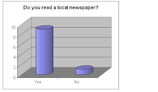
From this graph you can cleary see that most of the people we asked read a local newspaper and that there was only onle person who didnt.

Answers for age group 50+


From this graph you can see that we asked more males than females. We did this as in the previous catogory we asked more females than males so we thought it may equal out our results.
This age group said that the main function of a newspaper was to let them know what was going on and inform them on local information.
The main features that ages 40 – 49 were interested in were being informed with local events that will be happening in their area and what has happened. They also enjoy reading articles that involve interesting stories usually to do with crime. The sport section of the newspaper was enjoyed by mostly males.

In this age catogory you can see that a lot of the people we asked read their newspaper daily and some of them weekly. None of themr read it fortnightly or monthly.

We then were interested to find out what local newspaper they read. Similar to the other results, the Bristol Evening Post was the most popular, but there wasnt much difference between the ammount of people reading the North Somerset Times and the Clevedon Mercury.

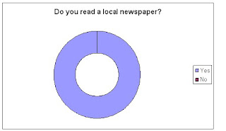
As you can clearly see from this graph, all the people we asked in this age group read their local newspaper.

Answers for age group 40-49


We then moved on to the age catogory of 40-49. This is slighty different to the other reults for this question as there are slightly more females than males where as the others were equal. As its not by any it shouldnt effect it to much.
This age group said that the main function of a newspaper is to know what’s going on and to keep up to date with important information.
The main features that ages 30 39 were interested in were attention-grabbing articles such as crime articles and death articles. They also enjoyed looking at the sport sections and local events that would be going on in their town.

We then wanted to find out how often that this age group read their local newspaper. These results are a lot different compared to the other results for this question. This age group read their newspaper a lot more often than the others as many of them read them daily or weekly.

We were then interested in finding out what newspapers this age group was interested in. As you can see the results are similar to the previous age group that the Bristol Evening Post was still the most popular followed by the North Somerset Times and then the Clevedon Mercury.

We then asked them if they read a local newspaper. In this age group you can cleary see that all of the people we asked read a local newspaper, showing that local newspaper in this age group was a lot more popular.

Answers for age group 30-39


We then moved on to asked 30-39 year olds and asked an equal number of males and females.
We were interested in what the 20-29 year olds views on a newspaper. We asked them what they thought the main function of a newspaper was. They said that the main function of a newspaper is to know what is going on in your local area and to be informed on local news.
We were then interested in the type of features and storys that this age group liked in their local newspaper. They gave us various answers and the most common were the articles on crimes, death and drugs. They were also interested in the sport and the local events that were happening or had happened in their area.

We then asked how often they read their local newspaper. In this ago group the results were similar to the previous age group. You can see that the most common time is weekly but there are a lot more people who read it daily and less who read it fortnightly.


We were then interested to find out what newspaper this age group liked to read. We asked them the about the main local newspapers in the area; Bristol Evening Post, Clevedon Mercury and North Somerset Times. It was close results between the Bristol Evening Post and North Somerset Times but more people read the Bristol Evening Post. In this catogory there were some readers of the Clevedon Mercury.

This was the next question that we asked. As you can see there were more people who read a newspaper than those who didnt. This is a lot more people than the previous age group 12-19 year olds showing that they are more interested in their local newspaper. We then carried on asking questions to those you did read their newspaper.

Answers for age group 20-19


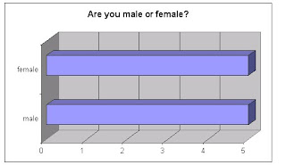
This was the first question we asked the age group 20-29. As you can cleary see we asked the same ammount of males and females so our answers to the other questions were equal

Thursday 17 September 2009

The final question we asked them, we were interested to find out what they thought the main funcion of a newspaper is. They aswered saying that it is to entertain, inform people on information and let them know what is going on.
We asked them what features they were interested in so it would help us know what sort of stories and features to put in our newspaper. Ages 12-19 were interested in local news to keep up to date with what was going on, the sport section and anything being advertised which they could take part in.

This was the next question that followed. From this graph we can work out that the most common time that they read their local newspaper was weekly. The others were split equally between daily and fortnightly.

From the people in this age catogory that did say yes to reading a local newspaper, we asked them what newspaper they did read. The most common newspaper was the Bristol Evening Post following by the North Somerset Times. None of them read the Clevedon Mercury. From this we were able to see what sort of newspaper this age group were interested in.